✳ Case study · Product design and build
Jobs machine.
Fewer applications, better ones.
An AI job search tool I designed and built for my own search. It reads every posting, scores it against my real work, rules out the jobs I can't legally take, and drafts the application. Then it stops. I read it, edit it, and press send myself.
- Role
- Solo: product design, brand and the full build
- Team
- Just me, also the first user
- When
- November 2026
5 days, 15–19 November - Stack
- Next.js, Supabase, Vercel, Claude or Gemini
Job hunting had become a reading job.
I was setting up a design studio, and in the meantime I needed work. That meant reading dozens of postings a day, most of which turned out, on paragraph six, to be US-only, a junior role in disguise, or tied to a time zone I couldn't work in.
The AI tools I tried made it worse. They were built for volume: auto-apply to hundreds of jobs, stuff the CV with keywords, send it in your name. That gets you filtered out, and it puts claims in your CV you can't defend in an interview.
- a
Reading, not deciding
Most of the time went on finding out whether a job was even possible, not on whether it was good.
- b
"Remote" means something else
Country limits, visa terms and time zones are buried in the text, so ineligible jobs looked like strong fits.
- c
Tailoring is slow and lossy
A good application meant rewriting a CV and letter from scratch, and picking the right case study each time.
Let the machine do the reading and the drafting. Keep the judgement and the sending with people.
Every later decision was tested against three principles. They became the landing page's first line too, because they are what make this tool different from the others.
Nothing is sent without you
No auto-apply, no emails in your name. The last step, applying on the employer's own page, is always yours.
Only your real facts
The writer may only use what is in your profile. Every claim in a CV traces back to a case study you wrote.
Your key, your data
You bring your own AI key. Your CV goes to the provider you chose and nowhere else. No credits, no recruiters.
What I chose, and what I turned down.
With no team, I was the designer, the engineer, the product owner and the user, which is a trap: you can justify anything. Writing each call down as "this, instead of that, because" kept me honest.
Eligibility is not part of the score
Instead of
One blended number where "US only" quietly lowers a 90 to a 60, so it still looks worth reading.
Because
Can I take it and do I want it are different questions. A separate chip rules a job out before you read it; the score only measures fit. Time zones work the same way: you say how far from your own you can work, and a requirement counts as met when the ranges overlap.
Score against case studies, not titles
Instead of
Keyword matching between job title and CV, which is what most boards do.
Because
Designers are judged on work. Setup asks for case studies in words, since portfolio sites are mostly images the model can't read.
Skip asks for a reason
Instead of
A plain dismiss button that teaches the system nothing.
Because
One tap ("salary", "too junior", "agency") turns each no into a record of why. Patterns in those reasons are what the next version of scoring learns from.
Share the jobs, not the CVs
Instead of
A single shared account, or two separate tools for people who search together.
Because
Job hunting with a partner or a future studio colleague means the same postings twice. A team shares the job pool, each person's fit and what they saved; CVs, letters and notes stay private. "Pass to teammate" sends a job across with a note.
Bring your own AI key
Instead of
A subscription with a credit cap, which means billing, accounts and a margin on every request.
Because
It keeps the tool free, keeps data with a provider you chose, and Gemini's free tier is enough for a few applications a day.
From a hundred postings to the five worth your evening.
Four steps. The machine handles three; the fourth belongs to you, and the interface makes that hand-over explicit.
Gather
Open job boards, hiring Y Combinator companies, Hacker News "Who is hiring" threads, RSS feeds and careers pages on Greenhouse, Lever and Ashby. Anything else, from LinkedIn or Wellfound, is pasted as a link or text.
machineJudge
A fast model reads each posting into facts (remote scope, allowed countries, salary, must-haves) and scores it 0–100 against your profile, with reasons and gaps.
machine · fast modelPrepare
For the jobs worth it, a stronger model drafts a CV, a cover letter and form answers. Each part is written separately and can be redone with a one-line correction.
machine · writing modelYou apply
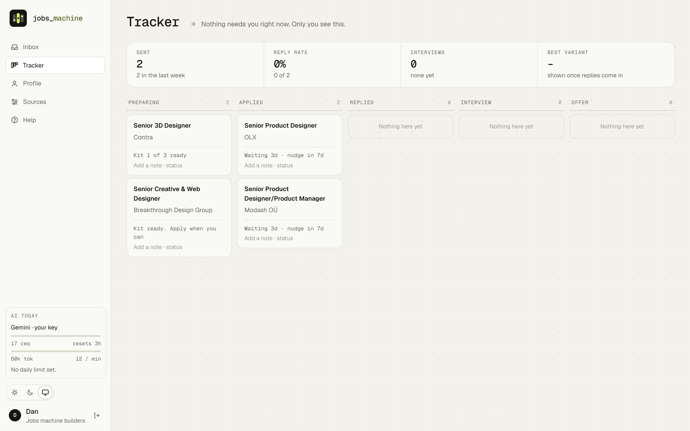
You read, edit, and apply on the employer's own page. Then you mark it applied and follow it on the Tracker, from saved to offer.
● youOne readout for fit, at every size
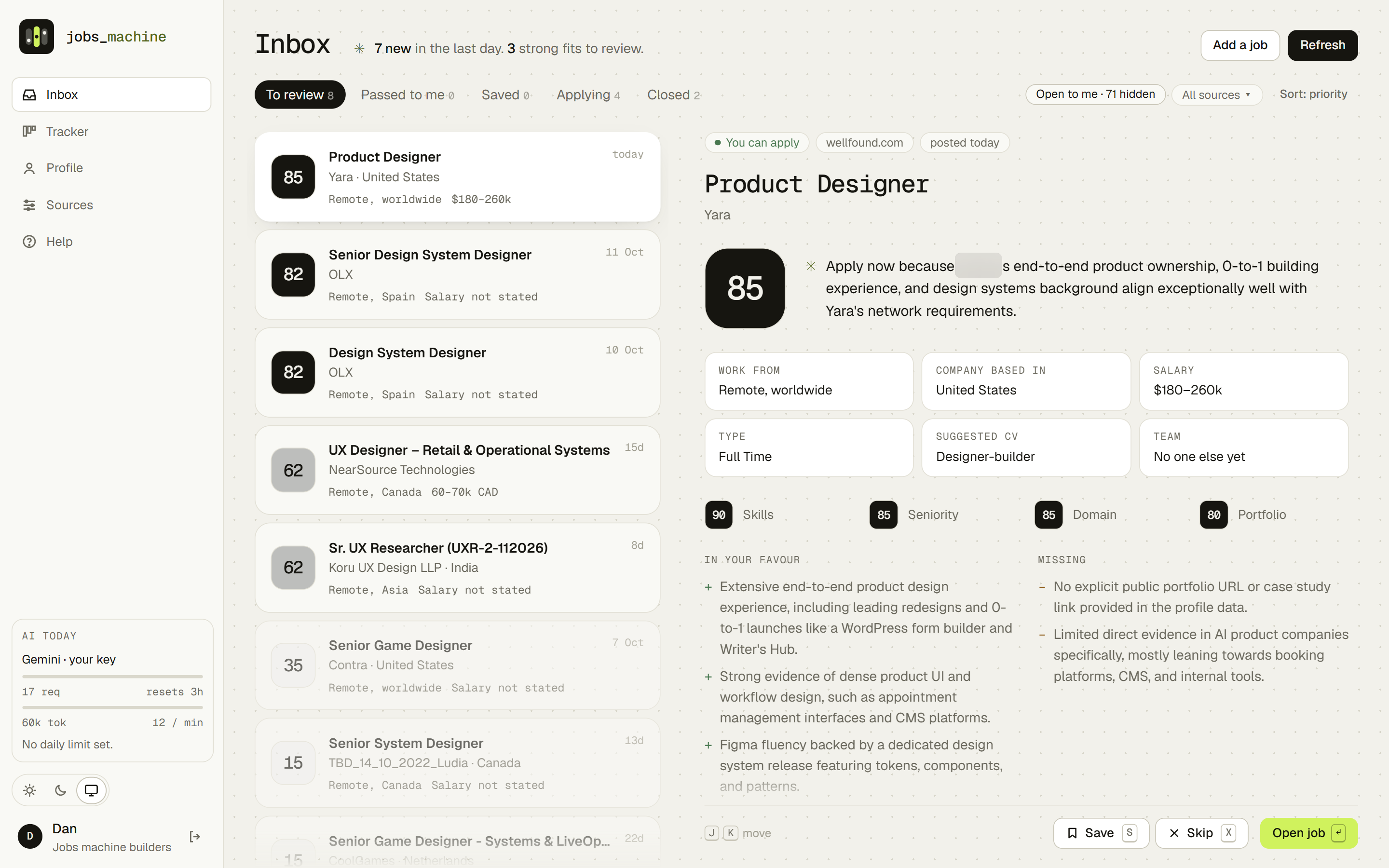
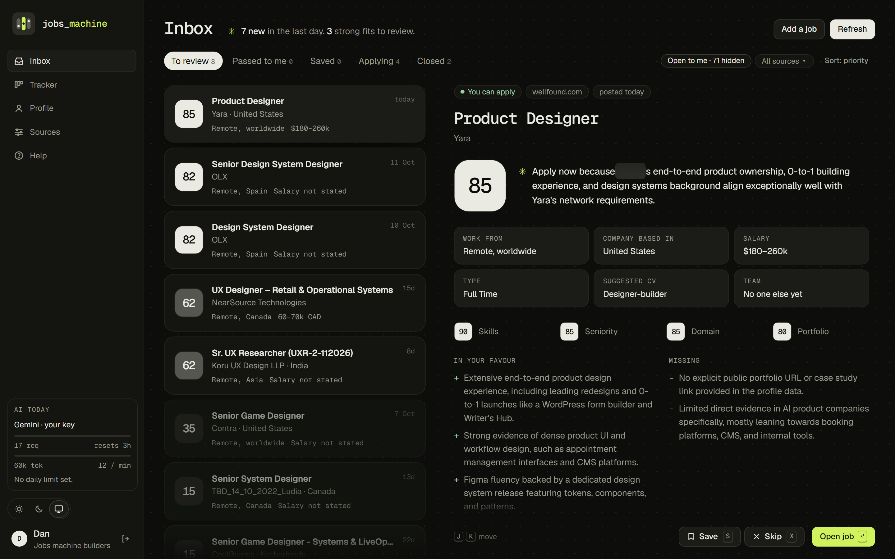
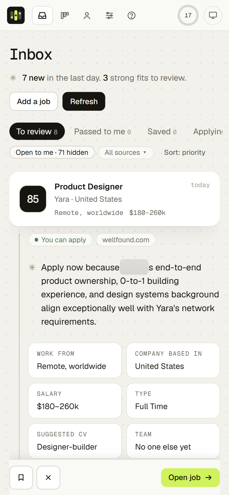
Early versions used a red, amber, green bar. It read like a school grade, and the colour pulled the eye away from the reasons. Fit is now a number on a square tile: solid ink for a strong fit, grey for a maybe, an empty outline for a no. It is the same piece in a list row, on the job page and on the landing page.
Under it sit four sub-scores (skills, seniority, domain, portfolio), so a 72 always comes with its reasons. Whether you can take the job at all is a separate chip, never folded into the number.
From the posting
"You'll own our design system and partner closely with frontend engineers."
✳ From the machine
Lead the letter with Atlas DS. It is your closest evidence for both asks.
Marking the machine's voice
The riskiest moment in an AI product is when a generated opinion looks like a fact. So anything the model wrote starts with ✳: verdicts, summaries, suggestions, the brief at the top of the Inbox. Text quoted from a posting never does.
It's a small glyph, but it lets you trust the interface: you always know who said what.
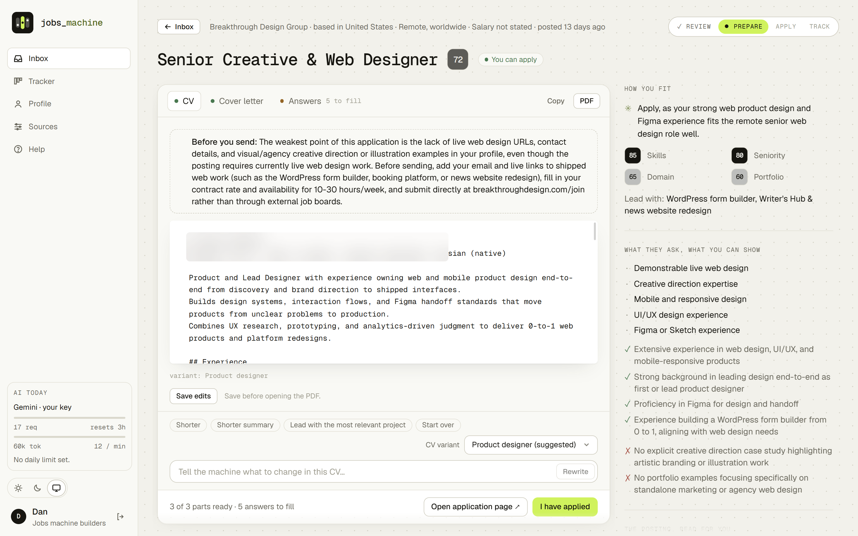
The workspace: the posting and the application, side by side
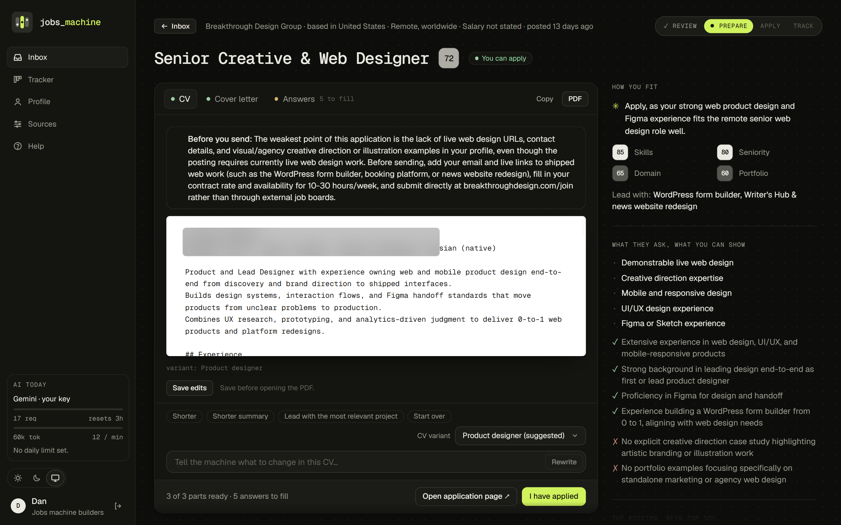
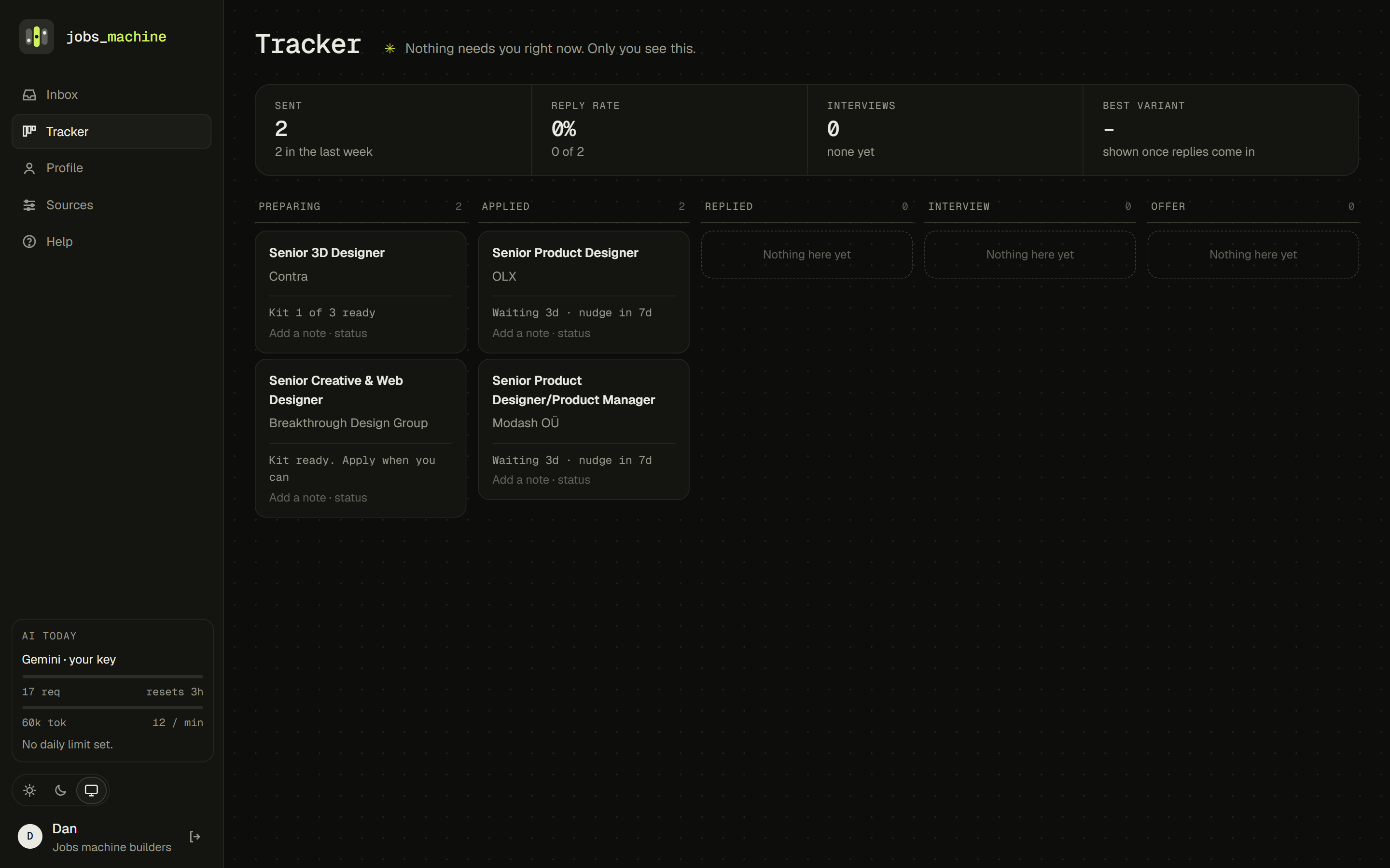
A job page walks through four steps: Review, Prepare, Apply, Track. The kit sits on the left, in tabs for the CV, the letter and the form answers. On the right: how you fit, what they ask set against what you can show, and the posting itself. Above the CV, a "Before you send" note names the weakest point of the application. Under it, quick chips (Shorter, Lead with the most relevant project, Start over) and a one-line "tell the machine what to change" field rewrite that part. The footer carries the last two steps: open the application page, then "I have applied".
The profile: the only source of facts
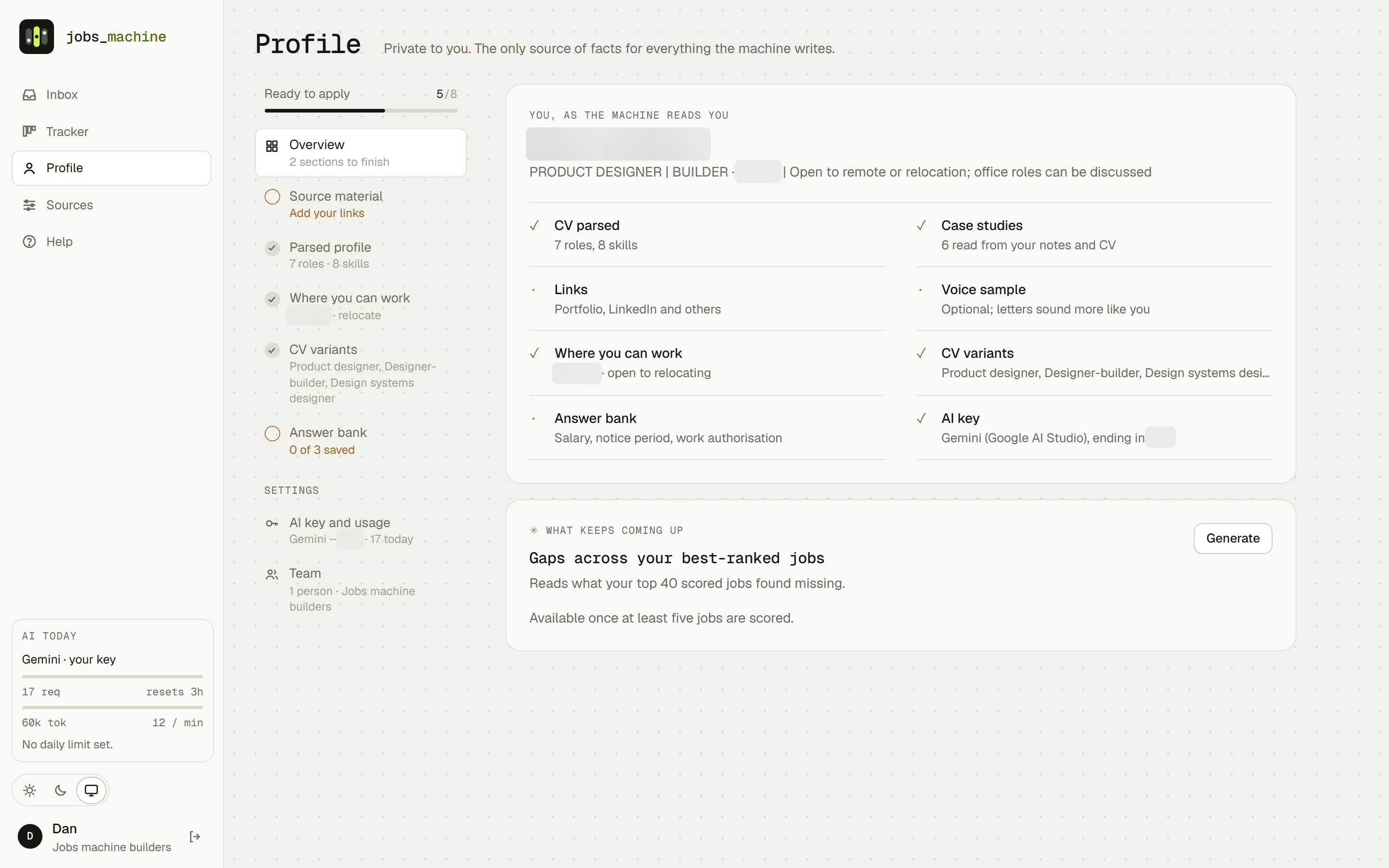
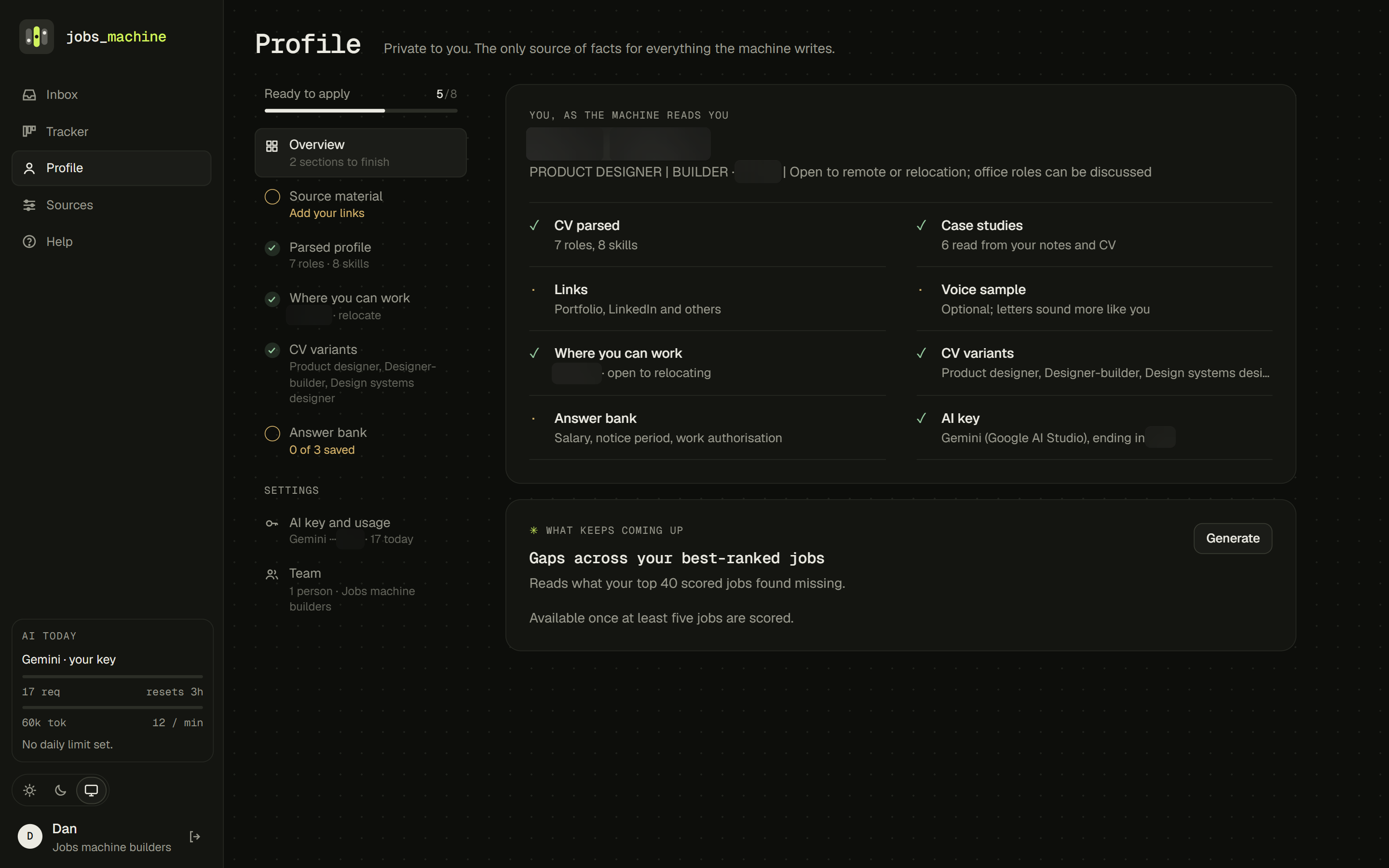
"Only your real facts" is a promise the interface has to keep. The Profile shows you as the machine reads you, with a "Ready to apply" bar and a done or needs-work mark for each section, so it's obvious what's missing before a weak profile produces weak applications. Settings (AI key, team) sit apart from the content. "What keeps coming up" collects the gaps across your best-ranked jobs.
Version one worked. It was also anonymous.
I built a working first version fast, then used it for real and wrote down everything that slowed me down. Then I redesigned it before building any further.
Jobs
Netherlands · Remote, EU · €85–100k · Full time
Platform team building internal tools for operations staff. Owns the design system and works closely with frontend engineers.
Strong match on design systems and B2B tooling.
Missing: Fintech domain; data-heavy dashboards
Suggested CV: Design systems designer
United Kingdom · Hybrid, London · Salary not stated · Full time
Growth squad running onboarding and activation experiments.
Relevant experiment work, but hybrid and health domain.
Missing: Health domain; on-site days
Suggested CV: Product designer
Three layouts, one chosen
Before touching the code I built three clickable directions in plain HTML with sample data: A, a split view; B, a dense ledger table; C, a focus mode showing one job at a time.
Ledger was fastest to scan but hid the reasons. Focus felt calm but made comparing impossible. Split view kept both the list and the "why", so it won, and the prototype became the spec.
Split view chosen
List and preview side by side.
Ledger
A dense table. Quick to scan, reasons hidden.
Focus
One job at a time. Calm, but no comparing.
The visual system: a quiet instrument
Colour
One loud colour, one meaning
Signal lime marks what the machine did or wants you to do next: its voice, highlights, the primary action. Buttons have three roles: lime primary, ink secondary, white tertiary. Nothing else is coloured.
Type
Mono for the machine
Geist Mono for titles, numbers and readouts (scores, salary, dates). Geist sans only for text you read at length or send.
84 · €95k Aa
Themes
Paper and Ink
Paper: ink on warm paper, lime as a highlighter. Ink: lime glowing on near-black. Saved in a cookie so the server renders the right one with no flash. Try the switch at the top of this page.
When you build it yourself, the constraints become the design.
Being the designer and the builder meant I met the hard limits myself, early, instead of in a handoff review. Several of the best interface decisions came straight from them.
Free-tier writing requests
About six full application kits a day. So each kit part (CV, letter, answers) became its own request, and a bad letter costs one rewrite, not three.
Rate limits, made visible
Calls are paced and retried. The rail shows a usage meter that turns amber at 80% and says in plain words how many kits are left and when it resets.
Cheap reading, careful writing
A fast model reads and scores every posting; a stronger one writes only for the jobs you chose. Spend follows intent.
Prompts are a design surface
The scoring prompt decides what "fit" means, so I wrote it the way I'd write interface copy: what to weigh, what counts as evidence, and a hard rule that the writer may only use facts from your profile. Output shapes are typed, so the UI can rely on a must-have list or a remote scope existing.
Failure states are product too
Pages that won't parse, keys that run out, a database missing a migration. Each got a plain-language notice that names the cause and the next step, instead of a spinner. A first-run setup lists exactly what you need, with how long each part takes, before the account exists.
Slow work moves to the background
Writing a kit can take up to a minute. In the first version that meant a disabled button and a frozen page. Now writing runs as a background job: you can go back to the Inbox and keep triaging, the job's card shows that a kit is being written, and a note appears when it's ready, wherever you are.
Numbers you can trust
Using it showed small lies. The "To review" tab said 78 while the list showed 7, because it counted jobs the list hides as not open to me. Now every count uses the same filters as the list, and the filter chip says how many jobs it hides. Title keywords now match whole words too, so "UX" stops matching "Benelux".
Waiting is designed too
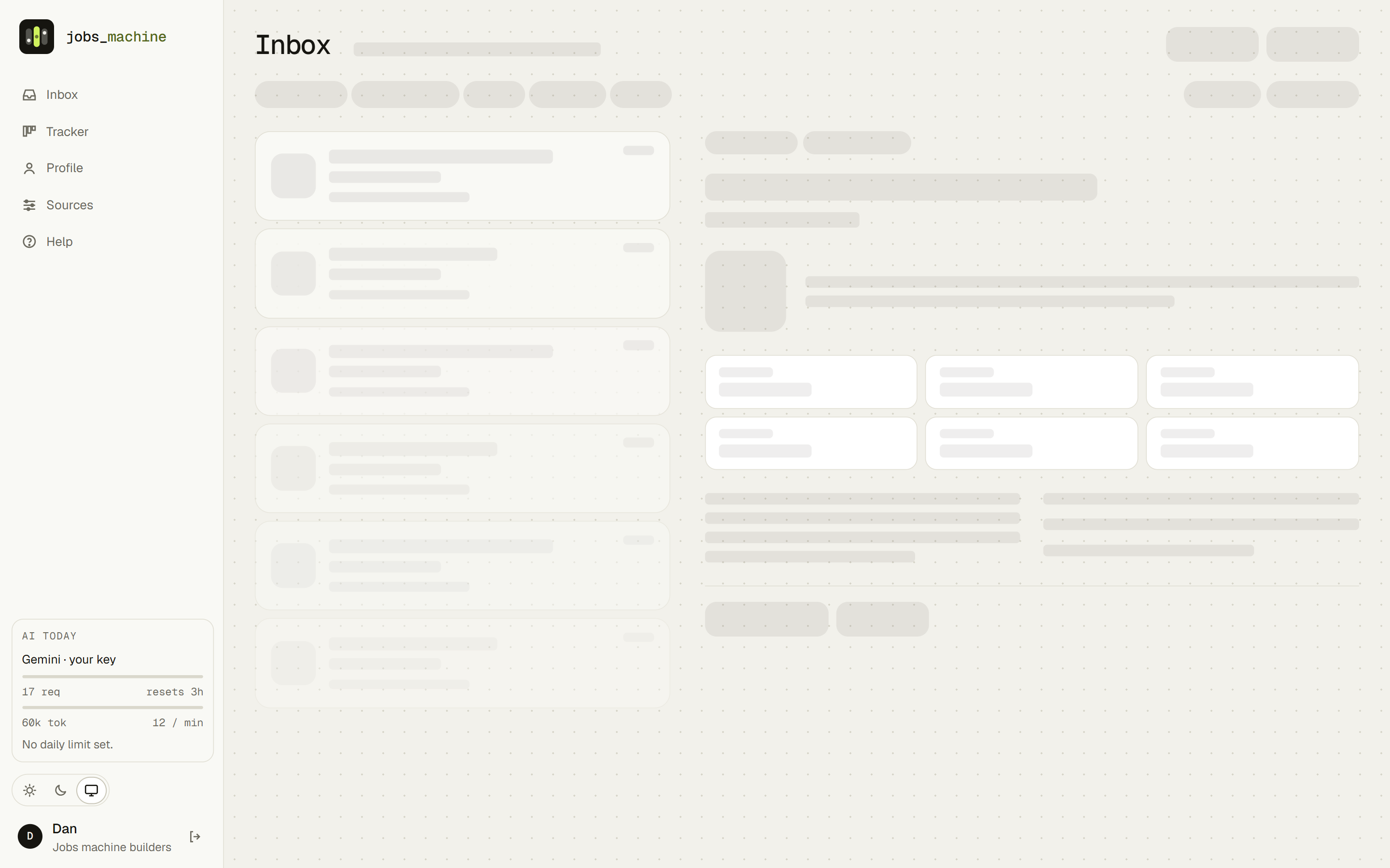
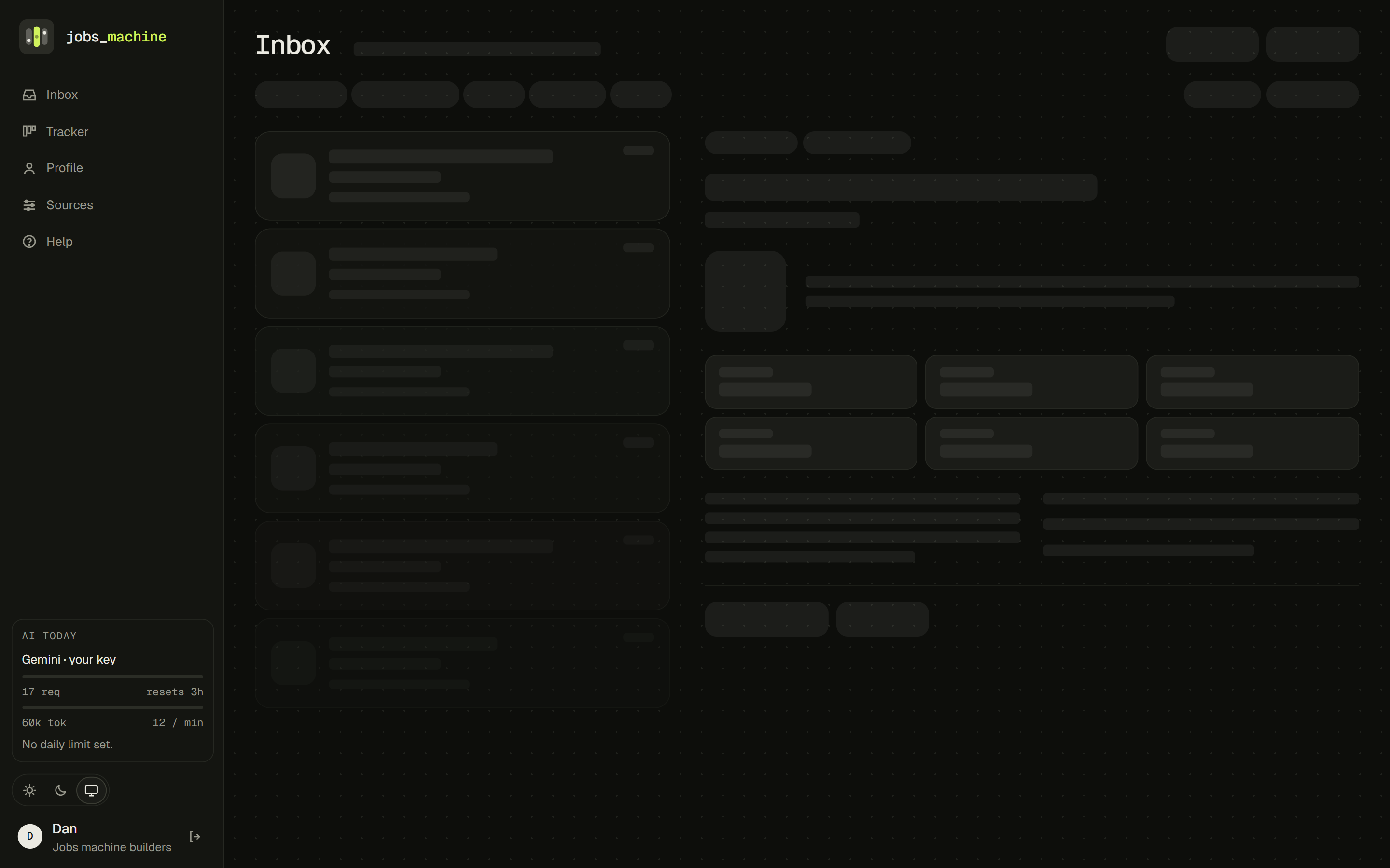
Every page loads data for the signed-in person, and that takes a moment. The shell (rail, navigation, theme) now draws straight away, while usage and the account stream in behind placeholders. Each data page has a skeleton shaped exactly like it, so nothing jumps when the content lands, and the logo's reels play a short wait animation only if a load passes 300 ms. Picking another job in the Inbox marks its card at once and shows a skeleton for the detail.
Working version, used for real
Sources, reading, scoring, kit writing, tracker. Ugly, but it found real jobs on day one.
Written rework, three prototypes
A list of problems from my own use, a design direction, and clickable HTML mocks for three layouts. No production code touched.
Rebuild on the new system
Tokens, themes and the rail first, so every page improved at once. Then the split Inbox, the two-column workspace and the usage meter.
Identity, landing page and onboarding
The logo, a public page that explains the principles, a privacy policy, a four-step setup and in-app help.
Skeletons and a guided Profile
Shaped placeholders on every data page, a loading logo, and a Profile that shows how ready you are to apply.
Steadier layout, background writing, more sources
Still headers with per-column scrolling, a pinned action strip, kits written in the background, Y Combinator and Hacker News sources, and a time zone range.
Shipped and in use
Hosted, with personal AI keys, light and dark themes, and motion that respects reduced-motion settings.
Three reels and one that stops in the right place.
The name invites a slot machine, which is exactly the wrong promise. So the mark keeps the reels and drops the gamble: three columns, the middle one lit and landed dead centre. A match, not a jackpot. It went through six rounds, generated from a small script so every variant stayed pixel-exact.
too technical
no focus
solid lime middle reel, ink dot
The same lime that marks the machine's voice and the primary action marks the landed reel in the logo. In the dark theme the tile turns charcoal, a step lighter than the page, so it still reads as a tile without glowing. On load, the landing page spins the reels once and lets them settle.
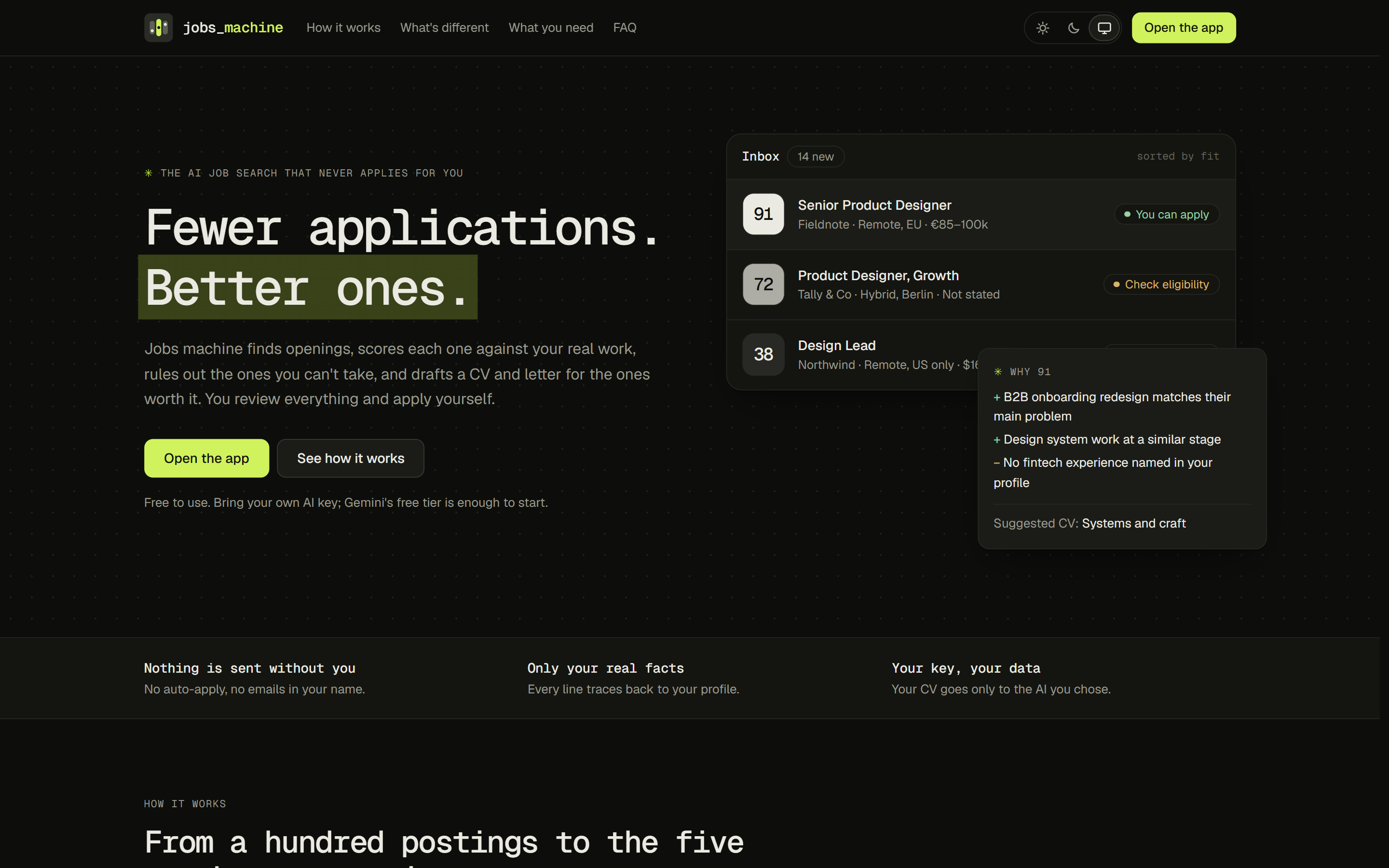
Most AI job tools optimise for volume. This one optimises for fit.
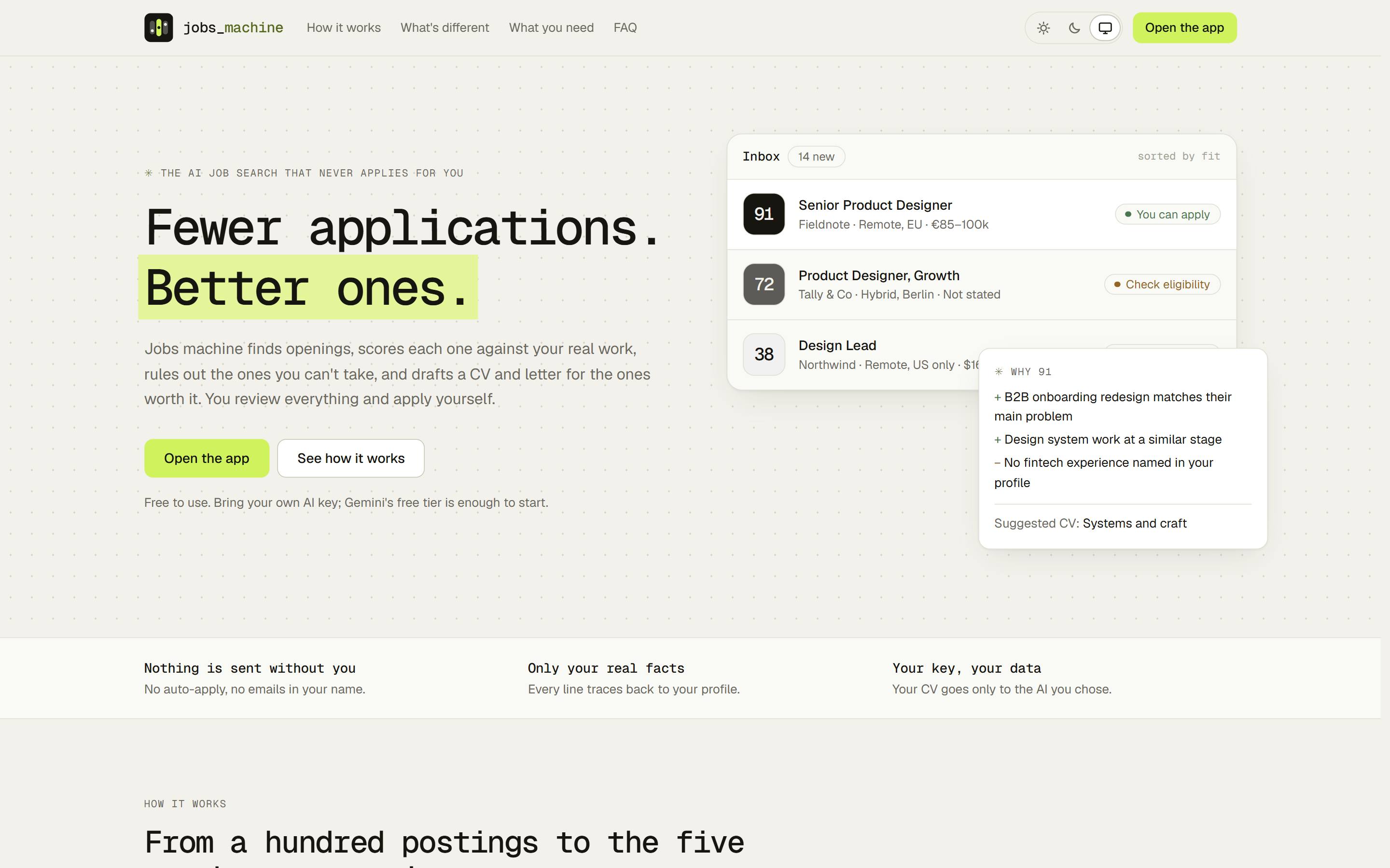
The public landing page leads with what the tool refuses to do. Its hero reuses the app's fit tiles and ✳ reasons, so the promise and the product look the same.
What I'd tell the next designer-builder.
Use it before you redesign it. The first version was deliberately plain. Real use produced a better brief than any persona would have: "I can't see the posting while I edit the CV" is a requirement, not an opinion.
Put restraint in the product, not just the visuals. The hardest and most valuable call was the feature I refused to build. Not auto-applying shaped the positioning, the trust model and the interface.
Prototype in the medium. Clickable HTML with sample data settled the layout debate in an afternoon, and it doubled as the build spec.
Be honest about what's unproven. The team features are built but haven't yet been used by two people at once. That's the next real test.
Where it goes next
- Shared pool, personal keys, themes, onboarding, help
- Y Combinator and Hacker News sources, background kit writing
- Two-person testing of passing jobs and seeing each other's fit
- Google sign-in
- Answer the real form questions where the job board publishes them
- A browser clipper for LinkedIn and Wellfound
- A reviewer pass that reads each kit as the hiring manager would
- The studio side: the same machine, pointed at client leads
✳ In one line
An AI product whose best feature is the thing it refuses to do.